Series Colors & Logos
Five of the six SDM Smart Graph Visuals support data-driven series colors and series logos — every one except the Gradient Heatmap, whose colors come from its color scale. Instead of relying on Power BI's default color palette and plain text legends, you can control the exact color and display a custom logo for each series — directly from your data model.
This is one of the key differentiators of the SDM Smart Graph Visuals compared to Power BI's built-in charts.
Overview
| Feature | Column | Line | Scatter | Radar | Pie |
|---|---|---|---|---|---|
| Series Color | Yes | Yes | Yes (role named Color) | Yes | Yes |
| Logo in legend | Yes | Yes | Yes | Yes | Yes |
| Logo in bars | Yes | — | — | — | — |
| Logo in end-of-line labels | — | Yes | — | — | — |
| Logo at the end of each axis | — | — | — | Yes | — |
| Logo in the small-multiple title | — | — | — | — | Yes |
| Colors applied to a choice of dimension | — | — | — | Yes | Yes |
Preparing Your Data
The recommended approach is to create a lookup table containing one row per series, with a color column and a logo column.
Step 1 — Create the source table
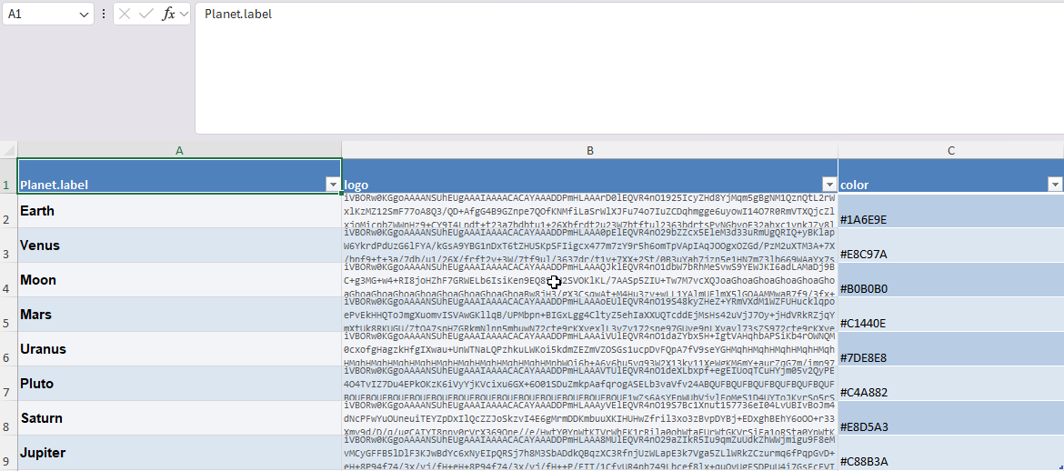
Create a table (in Excel or any data source) with at least three columns:
| Column | Description | Example |
|---|---|---|
| label | The series identifier (must match your Legend field values) | Earth |
| color | Hex RGB color code | #4682B4 |
| logo | Base64-encoded image | data:image/png;base64,iVBOR... |
Colors must be expressed in hexadecimal RGB format (e.g. #FF6347). Other formats like rgb(255,99,71) or color names like red are not supported.
Logo images must be Base64-encoded. You can generate Base64 strings using:
- AI tools — Ask an AI assistant to generate a simple icon as base64
- Free online converters — Search for "image to base64 converter"
- GIMP plugins — Export as base64 from GIMP
- The Python script provided below in this guide
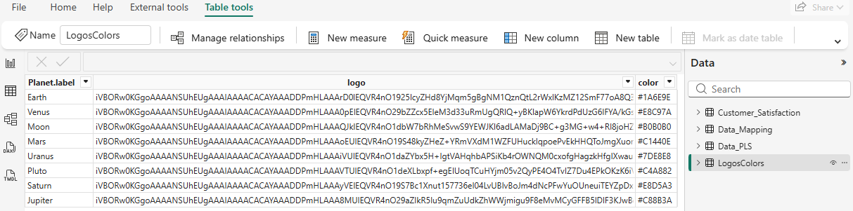
Step 2 — Load the table in Power BI
Import the lookup table into your Power BI model alongside your main data table.
Step 3 — Create DAX measures
Create two measures in your destination table to look up the color and logo for each series:
planet_color = LOOKUPVALUE(
    LogosColors[color],
    LogosColors[Planet.label],
    SELECTEDVALUE(Customer_Satisfaction[Planet.Label])
)
planet_logo = LOOKUPVALUE(
    LogosColors[logo],
    LogosColors[Planet.label],
    SELECTEDVALUE(Customer_Satisfaction[Planet.Label])
)
Step 4 — Assign to data wells
Drag your color measure into the Series Color data well and your logo measure into the Logo data well.
Expected result
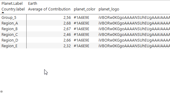
When configured correctly, Power BI displays the resolved data as a matrix:
- Rows — correspond to the Axis field (e.g.
Country.label) - Column headers — correspond to the Legend field (e.g.
Planet.Label) - For each combination, the visual receives the value from the Values field, the color from the Series Color measure, and the logo from the Logo measure.
Column or measure?
This is the single most common source of surprise, because Power BI binds the two very differently — and it does so silently.
| You drop a… | Power BI binds it as | It attaches to | Use it for |
|---|---|---|---|
| Column | A grouping, joined to the category axis | The category | A color or a logo that is an attribute of the category itself |
| Measure | A value, evaluated inside each legend group | The legend value | A color or a logo that identifies the series |
A column only works when it lines up row for row with the category axis. Drop a column that describes another dimension — a country flag while the categories are brands — and Power BI cross-joins the two: the category axis becomes every brand × every country. The chart still looks right, because the empty combinations carry no value, but the legend repeats each label once per combination.
Ask what the image or the color describes. "This is the Aurévia logo" — an attribute of the category, a column will do. "This is the flag of the market this chart is about" — an attribute of the legend, it has to be a measure.
A measure is the safe answer in every case, and it is the only one that works on the Column Chart, Line Chart, Scatter Plot, Gradient Heatmap and Radar: only the Pie Chart declares the Series Color and Logo roles on its category axis, so only it accepts a column there.
-- Attaches the value to the legend group, whatever the field wells contain
Flag =
CALCULATE (
    MAX ( Markets[country_flag_base64] ),
    ALLEXCEPT ( Markets, Markets[market_name] )
)
Color Resolution Priority
Colors are resolved in this order (highest priority first):
- Per-series conditional formatting (fx) — Rules set in the Data Colors card
- Series Color data role — Hex codes from your data model
- Power BI theme palette — The theme's automatic color assignment
- Default fallback — Built-in 10-color array
On the Radar and the Pie Chart the same field feeds only one dimension at a time: the threads or the axes on the radar, the slices or the series on the pie. The Apply colors to dropdown decides which, and the Data Colors card lists that same dimension.
Logo Display Locations
Once logos are loaded via the Logo data role, they can appear in multiple places depending on the visual type:
- Legend — Every visual that has a Logo role supports logos in the legend. Set Legend Display to "Logo and Text" or "Logo" in the Legend formatting card.
- Inside bars — The Column Chart can display logos inside bars. Set Bar Logo Placement to Center, Top, or Bottom in the Bar Settings card.
- End-of-line labels — The Line Chart shows logos alongside end-of-line labels when the legend position is set to "End of Line".
- At the end of each axis — The Radar reads the same field per axis as well as per series. Set Axis Logo in the Axes card to Replace, Above, or Beside the label.
- In the small-multiple title — The Pie Chart reads the field per category for the legend and per legend value for the chart titles. Set Title Display in the Series Title card.
Python Script — Convert a Logo Folder to Excel
The following Python script scans a folder of image files and generates an Excel file with two columns: label (filename without extension) and logo (base64-encoded image).
"""
Convert a folder of logo images to an Excel lookup table.

Usage:
    python logos_to_excel.py <logo_folder> [output.xlsx]

Example:
    python logos_to_excel.py ./logos logos_table.xlsx
"""

import sys
import os
import base64
from pathlib import Path

try:
    import openpyxl
except ImportError:
    print("Install openpyxl first: pip install openpyxl")
    sys.exit(1)


SUPPORTED_EXTENSIONS = {".png", ".jpg", ".jpeg", ".gif", ".svg", ".webp"}

MIME_TYPES = {
    ".png": "image/png",
    ".jpg": "image/jpeg",
    ".jpeg": "image/jpeg",
    ".gif": "image/gif",
    ".svg": "image/svg+xml",
    ".webp": "image/webp",
}


def image_to_base64(file_path: Path) -> str:
    """Read an image file and return a data URI base64 string."""
    ext = file_path.suffix.lower()
    mime = MIME_TYPES.get(ext, "image/png")
    with open(file_path, "rb") as f:
        encoded = base64.b64encode(f.read()).decode("utf-8")
    return f"data:{mime};base64,{encoded}"


def main():
    if len(sys.argv) < 2:
        print(__doc__)
        sys.exit(1)

    logo_folder = Path(sys.argv[1])
    output_file = sys.argv[2] if len(sys.argv) > 2 else "logos_table.xlsx"

    if not logo_folder.is_dir():
        print(f"Error: '{logo_folder}' is not a valid directory.")
        sys.exit(1)

    # Collect image files
    images = sorted(
        f for f in logo_folder.iterdir()
        if f.is_file() and f.suffix.lower() in SUPPORTED_EXTENSIONS
    )

    if not images:
        print(f"No image files found in '{logo_folder}'.")
        sys.exit(1)

    # Create Excel workbook
    wb = openpyxl.Workbook()
    ws = wb.active
    ws.title = "LogosColors"
    ws.append(["label", "logo"])

    for img_path in images:
        label = img_path.stem  # filename without extension
        logo_b64 = image_to_base64(img_path)
        ws.append([label, logo_b64])
        print(f"  Processed: {img_path.name} → {label}")

    wb.save(output_file)
    print(f"\nDone! {len(images)} logos exported to '{output_file}'.")


if __name__ == "__main__":
    main()
Strongly recommended: resize your logo images before encoding them in base64.
Power BI loads the base64 string for every single data point in the visual. If your logos are high-resolution photographs (e.g. 1024×1024 at 300 DPI), the data model will become extremely large and Power BI will slow down dramatically.
Recommended settings for logos:
- Size: 32×32 to 64×64 pixels maximum
- Resolution: 72 DPI (screen resolution)
- Format: PNG with transparency, or SVG for vector logos
- File size: aim for under 5 KB per image after encoding
A 64×64 PNG icon is typically 2–4 KB in base64, while a 512×512 photo can exceed 200 KB. With 10 series and 50 data points, that's the difference between 1 MB and 100 MB of data loaded into memory.